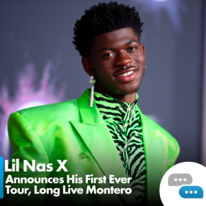
I met with a different focus group of 10 people for these posts. I came up with 4 different designs and they helped with deciding the best and more eye-catching.
Here are the questions asked.
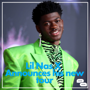
Which one would you prefer to see in your feed?
Everyone said number one. People mentioned the branding was obvious but not intrusive and everything was easy to read
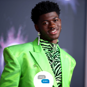
Which logo suits the posts the best?
The Group agreed that the first and forth posts were the most eye catching for the logo. They also mentioned that these don’t rely on the background image being acertain colour and so they would suit a wide variety of posts
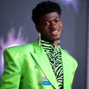
Do you prefer the outline on the post?
Most people agreed that the outline on both the post and artwork in the first two looked quite annoying. They liked the way that the outline was done in the third one with Lil Nas X’ hair poking though however they said that it looks better and less intrusive as edge to edge.
In conclusion I will move forward with design 1, as my focus group and research has shown that the logo and words sticks out a lot more on this one with the black gradient in the bottom with the white text as well as the colour logo being in a white circle allows it to be shown with any background colour and it will to still stick out. They also came up with some good points about the post outline looking intrusive so I’ll make sure to not include that!