This week is all about improving the Digital Image of Youths Choice, this will include detailed analysis of the updated posts, focus groups, and more! I will be creating these posts from as well as showing them to our new social media team! Here’s what I got up to
The Process of our new Instagram Template
- For any digital artwork, you need to work out your canvas size. For me, I’m starting with 2048 x 2048px this means it is square with an aspect ratio of 1:1 and works well for Instagram, Twitter and Facebook.
- I’ve named my artboard Instagram (Square)
- I’ve added my first layer, this is the background image. This is an image taken from Google (we will need to keep this in mind to give credit later)
- Next, I add the Youths Choice logo into the corner, this has a nice white contrasty background to help it stand out.
- I then add the white text and notice it needs something beind the text to allow it to pop.
- Adding the highlight too also adds the extra pop on Sam’s name, hopefully this will catch audience attention.
- The post looks done! Time for a focus group!


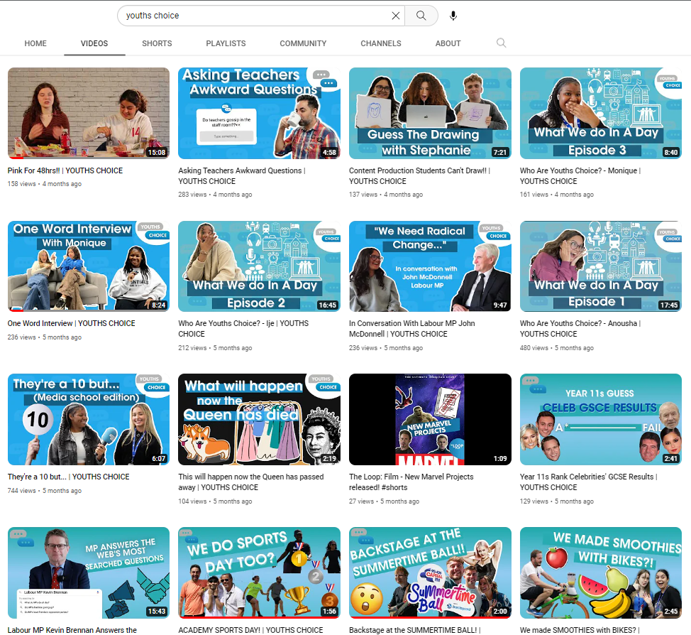
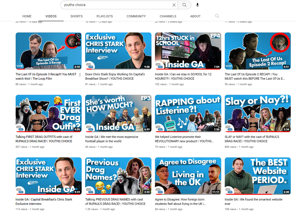
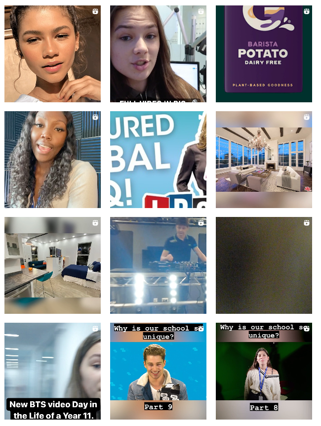
The Process of our new YouTube
- For any digital artwork, you need to work out your canvas size. For me, I’m starting with 1920 x 1080px this means it is rectangle with an aspect ratio of 16:9 and works well for YouTube Video Thumbnails.
- I’ve added my first layer, this is the background image. I’ve created a gradient with two of our brand colours
- I have now added the Biggest header and two smaller subheaders.
- Next, I add the Youths Choice logo into the corner, this has a nice white contrasty background to help it stand out. It’s been moved to the bottom left on here since the YouTube length annotation gets added on the bottom right
- I think the main header could stick out a bit more so I add the same hilight Instagram behind the titles on this post
- Finally it’s time to add some example faces from our presenter photos folder with a stroke round the side.
- The post looks done! Time for a focus group!


The Focus Group
For the focus group I came prepared with my ‘Before and After’ just like I mentioned. This is going to show them what the socials looked like before and after I changed things. Let’s see what those looked like and what people said!
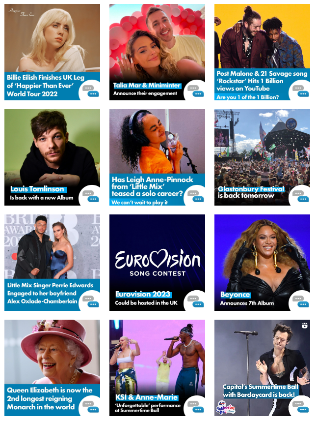
It looks great, the first person said. I really like how you have incorporated all the different platforms and made it all look consistent. If you look before on Instagram especially it’s a mess!
A second person said they loved the colours where now all the same on youtube as before they changed a lot.
A third person said I really like the consistency on the Loop’s TikTok page. the logo is all in the same place and it’s a consistent background with new and friendly faces.
The final person said they loved all the changes but wished that we had used something other that the brand blue for the the highlight for the words