In my research and problem-solving, I identified one main area of improvement for the Digital image of Youths Choice this was; Post Consistency, making sure our brand looks uniform across all platforms and styles. I conducted research into what other brands do on their platforms, and I got these results of what makes a great digital image. Consistent brand colours, using the brand font, showing the brands logo, making sure the text contrasts with background colours and making featured people or objects stick out.
In my problem solving section I drafted a post, this has created the basis for my practical skills task in the coming weeks.
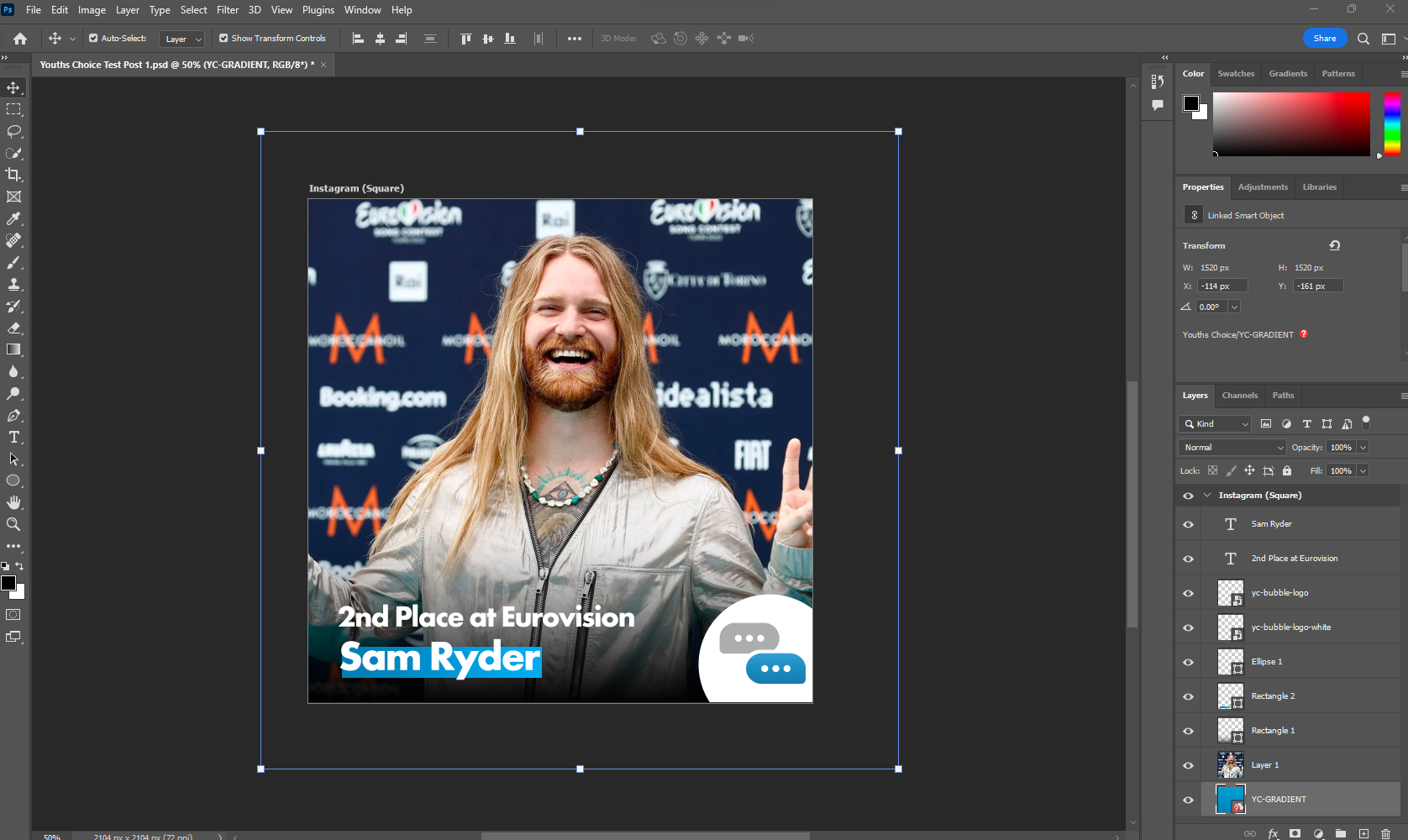
You can see in this post example I’m using 7 layers, the first two are the text, these are in the brand font, in adherence to the brand guidelines, placed in the left hand corner, next 2 layers are the YC logo in the bottom corner and the outer Ellipse in white to help with the contrast, the next rectangle is the background for the ‘Sam Ryder’ text, this again helps with contrast and making this POP from the screen. It’s especially helpful with celeb names or catchy phases as this grabs the viewers attention, under this we have a black gradient again to help contrast the background. The final layer is the background photo if Sam himself, this is to help with viewer attention.
Experimentation…
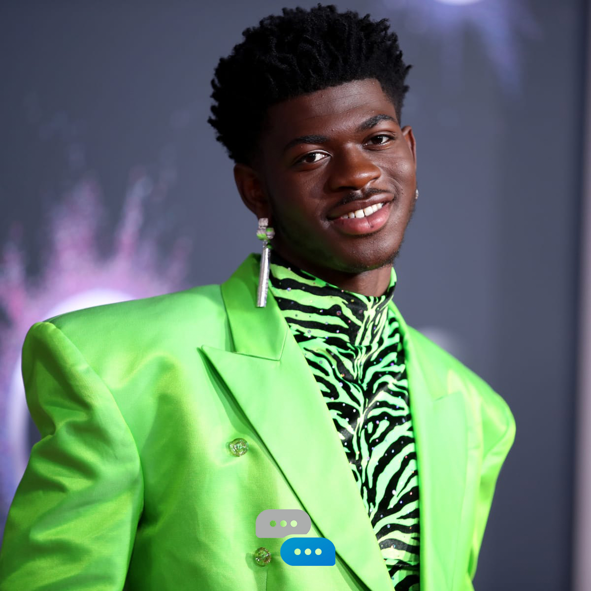

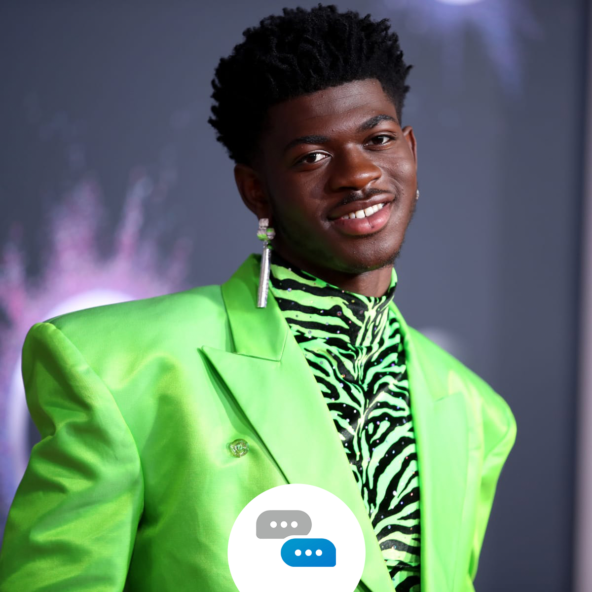
I bet you are wondering, well, how did you get there?! Well, this will help you! After I conducted my research and problem solving I had to start making this post. I started with one about Lil Naz X and his new tour.
In the first photo, you can see me using the coloured YC logo with nothing in the background to contrast it, this created a massive clash of colours and so wasn’t moved forward with.
In the second photo, I tried adding text to feature his new tour, again the same as the logo clashed with the background photo, I liked the way his head popped in front of the line however, I didn’t like the border. Upon showing this to a colleague they also agreed the border around the outside didn’t add anything to the post and instead restricted the viewable space.
The 3rd photo was similar to the first but we added a white circle behind the logo. This did add the contrast we were looking for however didn’t work it was in the middle and it felt too high up… That’s when I finished and created this post…

Now the post aligns with everything we liked about the previous posts and everything I learned from my research. The logo placement being in the right-hand corner rather than the middle, the black fade in the background to help with the contrast, and even the suttle Youths Choice branding in the bottom left with the gradient line will help the text pop from our phone and draw your eye’s attention towards it.